Timeframe
2 Months
Role
UX/UI Designer
Programs Used
Figma, Illustrator, Photoshop
Figma Link
Write-Up
Product Website for JBL
We were tasked to develop an informational website/app prototype designed to teach users about new content. Using different laws and principles of user interface design to guide our process, we were tasked to demonstrate our ability to produce an interface that allows users to have an intuitive and smooth navigation experience, as well as present content in a way that is easy for users to understand and memorize information.
Goals
Our goals for this project were to produce an interface that allowed users to have an intuitive and smooth navigation experience, present content in a way that was easy for users to understand and memorize information and design an interface that took into consideration the various laws and principles of user interface design that we learned over the course of the semester.
Write-Up
To start off, we put together a project write-up that described how we would plan to use various laws and principles of user interface design in our final project. In our project proposal, we explained how we would plan to use each UI principle in our final design. Check out the link below to view my final project proposal and learn how we planned to use each UI principle in more detail.
User Interface Principles
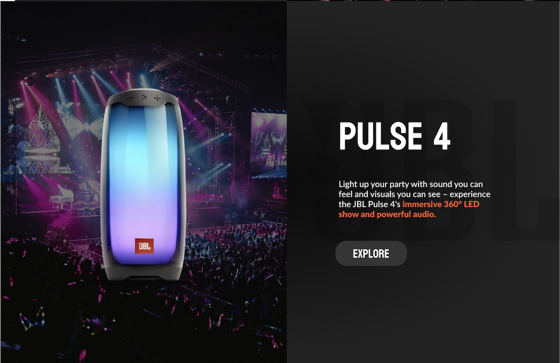
The Spatial Contiguity Principle states that learning is enhanced when text is directly integrated into related pictures/media. I utilized this principle by conjoining certain text into photos of the speakers. Doing this effectively helps users learn what specific features are being highlighted.
Spatial Contiguity Principle
Enhances learning and promotes faster digestion of prioritized content.
Text and Graphics
Jakob’s Law
Jakob’s law expresses that users are likely to favor websites that operate in ways like ones that they’ve used previously. I implemented this law by adding a navigation bar. This ensures user comfortability, and minimizes overload when having to navigate around the website.
Ensures user comfort and optimal navigation throughout website.
Familiar Layout
Von Restorff Effect
The Von Restorff Effect expresses when three or more similar items are shown together, the one that is different from the others will be memorized. Taking this into consideration, I decided to change the design of certain words within the body text to a more bolder, orange color. By drawing attention to specific words through color, I aim to help users remember certain product features more effectively.
Facilitates a more direct approach, accelerating the understanding of product features and enhancing the overall user experience.
Highlighting
For my final project, I developed an informational website with the goal to teach users about JBL’s most popular Bluetooth speakers. Check out the link above to view my project!
Final Prototype
Takeaways
After finishing this project, I realized that designing an interface involves more than just making it look good. Designers must consider how the mind works to reduce the mental effort required from users. I plan to apply what I've learned as I move on to more complex designs.
By focusing on user attention, how information is processed, and mental models, we can create interfaces that are not only attractive but also user-friendly. Techniques like breaking down information, using familiar layouts, and giving clear feedback help minimize mental overload. As I take on more challenging projects, I will use these ideas to improve usability and make interactions smoother. It’s important to balance visual appeal with cognitive needs to create effective and enjoyable interfaces.


