
Timeframe
Semester-long
Team Members
Tony Ramirez (Me), Maya Arnold, Alexis Fernandez
UI Redesign for NASA.gov
The objective for this group project consisted of finding a government website that was outdated and redesigning it using usability testing.
The Problem.
NASA’s website consisted of many navigation bars, as well as a variety of topics to choose from. This made it very overwhelming for the user to find what they were looking for. The Homepage was flooded with news stories, and its UI just looked very outdated.
Our NASA website redesign usability test revealed user frustrations with the overwhelming and confusing navigation bar, causing delays. 4 out of 7 participants found nothing frustrating, while others struggled to find the moon and Apollo 11 video. Participants found Hurricane Hilary's story easily, but had difficulty with the ISS location. Most users believed navigation would improve quickly. The homepage’s visual appearance received a neutral score of 3.43, with negative comments on the navigation bar's accuracy, vagueness, and font.
Before

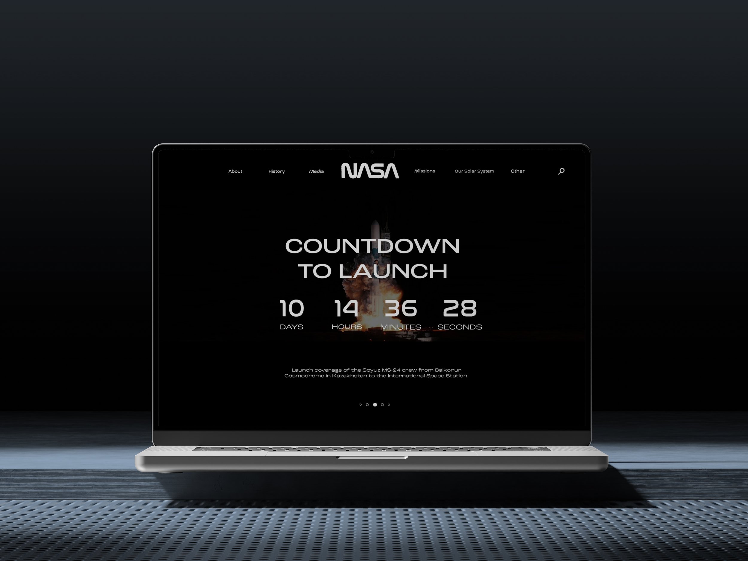
Proposed
Changes
In conclusion, our participant's main concerns were centered around the search engine and navigation bar, as they encountered difficulties using these features during the assigned tasks. To address these issues in our redesign, we opted to revamp the layout of the homepage. This strategic decision not only aims to enhance user engagement by capturing their attention but also to infuse the interface with a contemporary touch, thereby ensuring a more user-friendly and visually appealing experience. I was tasked to create the homepage layout.