
Timeframe
N/A
Status
Ongoing
Figma Link
SipScore
Sipscore was created for a summer project for my UX class. We were instructed to update/design a website home page and a login screen for a mobile application utilizing any brand or our own brand.
I created my own concept brand Sip-Score for my project because I have always encouraged people to try out new alcoholic beverages and review those they have already tried. This lessens the chance that you'll spend money on a new beverage that you might not particularly like. And increases revenue with smaller brands that maybe not many people know about. This also increases User Experience within shopping in store for consumers as the risk will decrease with prior knowledge of a new brand's alcohol if one decides to try out a new item.
The Idea
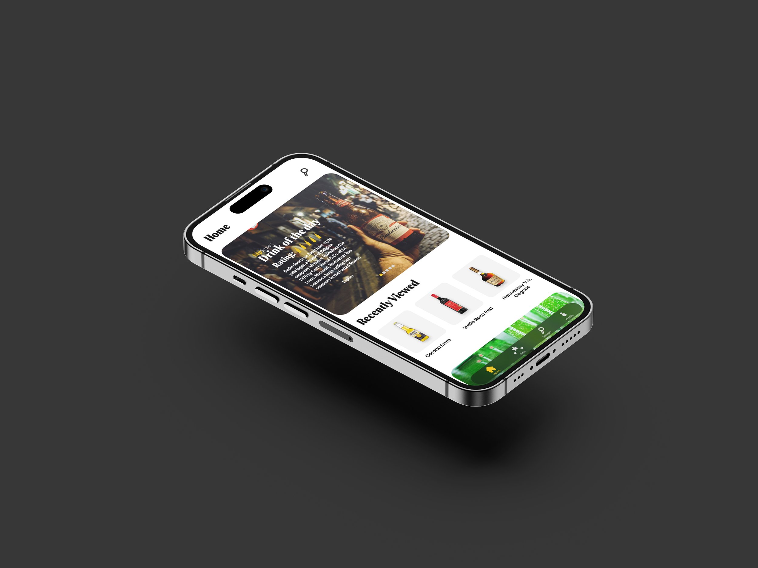
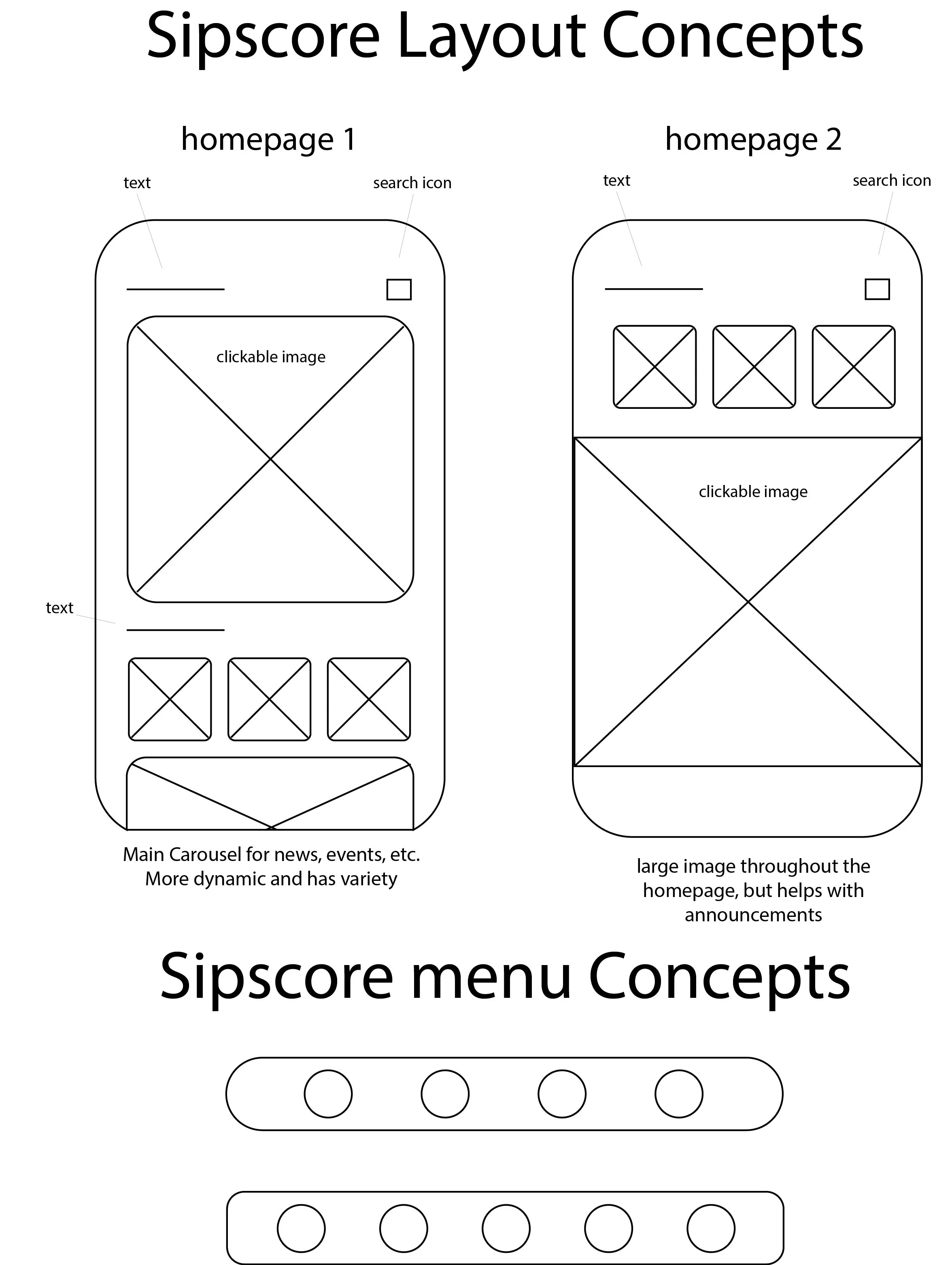
The wireframes for this project are focused on displaying important information while keeping the layout as minimal and as organized as possible. The user will be able to easily navigate through the mobile app without being either confused or overwhelmed. The final homepage layout I chose was concept 1
The Concepts
The app is designed to be easily navigated. The flow chart below shows how the user is able to access what they need to in just a couple of steps.
The Flow Chart


I wanted to go with a minimalist, sophisticated look with the interface, as this app is designed to for ages 21+. It will focus on the drinks you have chosen as favorites and will tune the recommendations from reviews of other users to display to the homepage.